 These lovely room images are from the portfolio of Austin Harrelson a Miami based design firm. He has been previously named by House Beautiful as one of "America's Top Young Designers".
 I LOVE built in bookshelves - they would have to be one of my favourite architectural features! The bordered detail around the roman blinds is beautiful. I have been using bordered Romans in a few of my projects recently and love the way they look in a room.


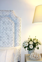
For me the bedroom, although you cannot see much of it, looks very comfortable and practical - not too "designed".
Images: Austin Harrelson






.jpg)


20 comments:
I love built in bookcases, that's one thing I'm asking the builder to include in our new home. I have hundreds of books so could be interesting!!
Gorgeous images Amanda, I love built in bookcases too and the bordered Romans... beautiful! Would love to see some of your recent projects... I need some great ideas for my place! Love the antique pedestal table too...... just what I need for my Great Room, a little table, a couple of chairs and lots of books to read at it! A-M xx
What wonderful images Amanda.....My post today on white bedrooms makes me want more colour. I don't really think that the all white look is very inspiring. I wouldn't have it in my home.....but these pictures...I'd have any one of them .
The built in closet is really a great alternative.
L
Absolutely Gorgeous!!
Fresh and clean ~~~
xo Laura
Great design by Mr. Harrelson. I really love the large zinc lantern over that spectacular table & chairs. Very unexpected. I agree that the bedroom is refreshingly not over-decorated. Something we don't see as often any more. Lovely post!
Love his work.
XX
V
Gorgeous pictures!
I love it; the modern, clean lines juxtaposed with traditional woods and furniture! Lovely!
bisuos,
La C.
I love his work. It is so lovely and I just adore how he mixes styles so effortlessly.
I love the third image Amanda - the mix of chairs and the interesting pieces around. Great choices of interiors, xv.
Very nice, all of them.
I love the lamp over the table..two differents style but really well mixed!
Thanks for your comment...I always have the bst time with my Mum!!!!
How chic and like you said, not too designed. Thanks!!!
I so love that purple drapery in the image 2nd from the bottom! the lightness of the chair with the coral lamp. pure heaven
so clean an feels like easy living... aaahhh refreshing for sure!
Soft, elegant and very, very stylish!
I love these rooms...a little modern, a little tradition with a twist...perfect fit!
I really love his look - it is my preferred look too, although I have always called it "pared down traditional". But I love the idea of fresh traditional!
I am also a fan of Roman blinds and love the fabric border on the edge. Thanks for bringing this wonderful designer to light!
xo Terri
I could move right in...it fits me and is simple. Like it.
Post a Comment